8 App Store Screenshot Tips That Help People Tap Get
Most people decide whether to download an app without reading a word of its description. They scroll past the icon, glance at the screenshots, and tap Get or move on. Here's what helps those few seconds go your way.
1. Make the first three carry the whole pitch
In search results, the App Store shows the first three portrait screenshots (or the first landscape one) right under your name. That's your real listing for most people. Put the single most useful thing your app does first, the reason to keep using it second, and the thing that makes it different third.
2. One idea per slide
Each screenshot should answer one question: what does this screen let me do? If a slide needs two headlines to explain, it's two slides. A set of eight clear ideas beats four crowded ones.
3. Headlines short enough to read at thumbnail size
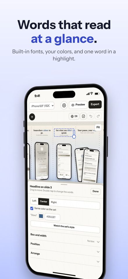
In search results, a screenshot is about the size of a business card. Three to six words, big, with the important word in color, reads at that size. A full sentence doesn't. Shotstand's checks flag a headline that's too long to read there, and anything that runs off the edge.
4. Show the real app
People want to see what they'll actually be using. Real screens in a device frame do more than abstract art or a lifestyle photo, and they're what App Review expects. If a screen is busy, frame in on the part that matters instead of hiding it.
5. Keep one look across the set
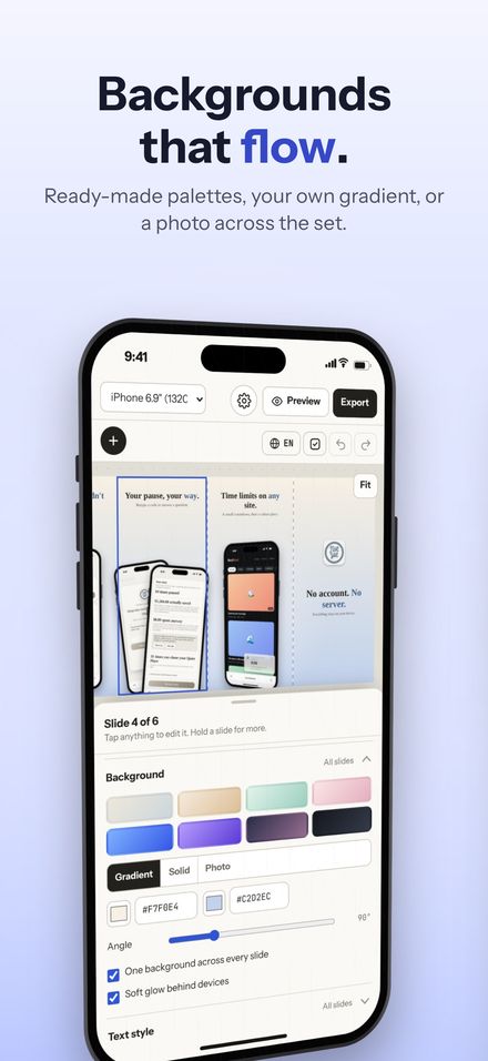
The same background family, the same font, the same device angle. A consistent set reads as one designed thing, and a background that flows from one slide into the next turns a row of cards into a single wide picture as people swipe.
6. Use the space between slides
A device lying across two slides, or a headline that continues onto the next one, gives people a reason to keep swiping. Use it once or twice, not on every slide.
7. Make sure it's sharp
A screenshot stretched bigger than its real size looks soft, and soft looks cheap. Capture at full resolution on the device itself, and save at the exact size App Store Connect asks for rather than resizing afterward.
8. Translate the words, not just the description
If your listing is in more than one language, the screenshots should be too. A localized headline on a localized screen does more than any translated description. Each localization in App Store Connect can have its own set.
Shotstand is built around these: layouts that span slides, palettes that flow, checks for long headlines and soft screenshots, and, with Premium, a copy of the set per language. See what it does, or try the live demo there.